You’ve probably seen “buyers also bought” recommendations. To drive more sales, you highlight items that are frequently purchased together. For example, the screenshot below shows “frequently bought together” for a monitor on Amazon.

Basket Analysis
One source for recommendations is basket analysis. Basket analysis literally means analyzing shoppers baskets. If you could line up all your user’s carts, and count how many items are purchased together, you can make informed recommendations to shoppers. For example, check out these baskets:
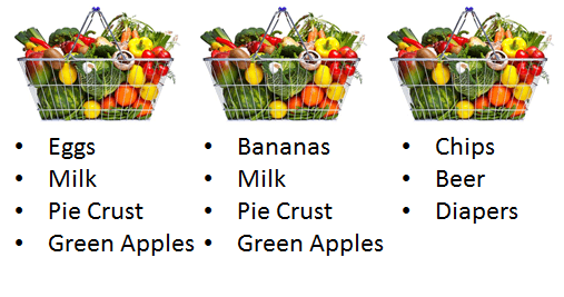
You can see above that pie crust typically goes with green apples. You can use this information to:
- Implement “Buyers also bought” recommendations
- Suggest to shoppers that they might be missing something when they check out
- Perform personalized recommendations
- Personalize search to cater to user’s past purchases
All in service of better sales!
And as an aside, while it’s useful to think about finding patterns in baskets, you can define your “basket” to be anything very narrow (an actual basket) to something very broad (every item a user has ever purchased). And don’t limit your thinking to just shopping! User browse sessions, interactions at conference booths, all these things can be “baskets.”
Can we just use raw counts?
Let’s poke around how one would use basket analysis to implement a basic “buyers also bought” recommendation system. What would be the first pass you’d make at implementing this?
One naive implementation of basket analysis works based on just raw counts. Given the baskets below, what should be recommended to users that purchase “pie crusts”?
| Basket A | Basket B | Basket C | Basket D | Basket E |
|---|---|---|---|---|
| Eggs | Eggs | Eggs | Eggs | Eggs |
| Milk | Milk | Milk | Milk | |
| Pie Crust | Pie Crust | Pie Crust | Cereal | Ground Beef |
| Green Apples | Green Apples | Pumpkin Filling |
With a count based solution, you:
- Filter down to baskets with just pie crusts (baskets A, B, and C)
- Count the other items in those baskets
- Recommend the most common items in those baskets as related to pie crusts
If we follow those steps, we can start with basket A beginning our counting:
- Eggs (1)
- Green Apples (1)
Next to basket B
- Eggs (2)
- Green Apples (2)
- Milk (1)
Finally adding in basket C, you get:
- Eggs (3)
- Green Apples (2)
- Milk (2)
- Pumpkin filling (1)
Examining the counts, you see we’d recommend that pie crust shoppers buy eggs.
But wait, that doesn’t seem particularly smart. If you examine our other baskets, everyone buys eggs. The pie crust baskets have specific items that have a more specific affinity: other pie ingredients – green apples and pumpkin filling. These items don’t occur in other baskets. Because of this concentration, we ought to be really promoting these items.
Using just raw counts, you’ll always bias towards global popularity and not what’s special about this subset of the data. You don’t capture essential pie-ness of this data set. This problem has a name: the Oprah book club problem. The name comes from book recommendations. Everyone buys what Oprah recommends. Using these raw book sales you’d recommend that owners of Science Fiction read Eat Pray Love. Just because Eat Pray Love ends up on every Science Fiction fan’s bookshelf doesn’t mean that it’s particularly related to science fiction fan’s tastes.
Statistically, we need to test the significance of the relationship, not just the raw count. Let’s explore ways of getting at the significance of a relationship between two items:
Naive similarity measures (Jaccard and z-tests)
The next approach to performing recommendations is to use the humble Venn Diagram. Venn diagrams are always helpful, right? They always helped me get at least a C in middle school math :). Anyway, if we thought about baskets that had eggs and pie crust, we might see the following:
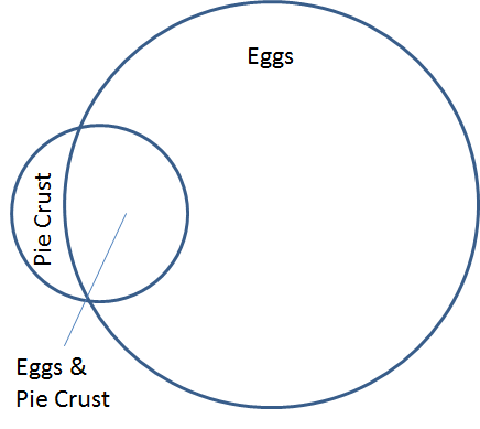
In the last section, we just used raw counts in the scoring. Which corresponds to the size of the filled in black area below:
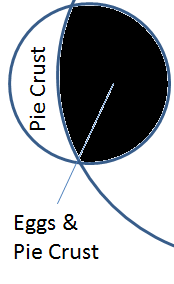
This amount of overlap is larger than the amount of overlap comparing pie crust to green apples:
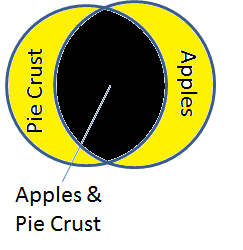
As we stated in the last section, the size of the overlap shouldn’t be taken just at face value. This overlap size corresponds to raw counts. Instead this overlap should be considered relative to how many total baskets have eggs OR pie crust. In other words, how much of the overlap dominates the larger yellow area below?
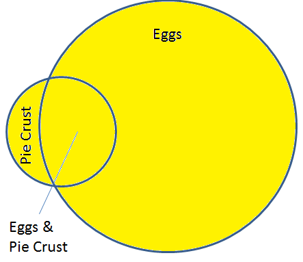
If the overlap (black area) is very close to the total number of baskets with either eggs or pie crust (yellow area) then we’re onto something statistically. Mathematically, this is known as the Jaccard Similarity. Given two sets A and B, the Jaccard similarity is the intersection of A and B (the black area, the raw counts from before) divided by the union of A with B (the yellow area, all baskets with eggs or pie crust). Restating mathematically, you could say: A AND B / A OR B.
Think about it this way. If items always occur in baskets together (say peanut butter and jelly), then their Jaccard similarity will be 1:
- Baskets with both peanut butter and jelly: 500
- Baskets with either peanut butter or jelly: 500
- Jaccard Similarity: 1.0 (exactly alike)
Compare that to two foods that never go together: sugar free pancake syrup and Bob’s giant bag o’ sugar:
- Baskets with both sugar free syrup and giant bag o’ sugar: 2
- Bags with either sugar free syrup or giant bag o’ sugar: 1000
- Jaccard Similarity = 2 / 1000 = 0.002 (very low similarity)
Mathematically, if we revisit the pie crust baskets and score eggs and apples, we see this born out:
Eggs & Pie Crust:
- Baskets with both eggs and pie crust: 3
- Baskets with either eggs or pie crust: 5
- Jaccard Similarity: 3 / 5 = 0.60
Compare to Pie Crust and Green Apples
- Baskets with both pie crust and green apples: 2
- Baskets with either pie crust or green apples: 3
- Jaccard Similarity: 2/3 or 0.6666…
As we see with Jaccard, apples beat out eggs for pie crust purchasers (though just barely!)
Problems with Jaccard
It may be a bit surprising that eggs still are highly recommended for pie crust purchasers. Indeed, this is a problem with Jaccard similarity. When we look at the distribution of product purchases, we can see the problem:
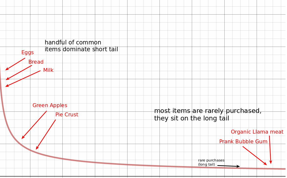
Some items are purchased by everyone (eggs). Others are moderately purchased (pie crust). But there’s an extremely long tail of extremely rare purchases of things like organic llama meat and prank black teeth bubble gum.
When these rare items overlap, the Jaccard similarity scores the relationship very high. If someone happened to buy organic llama meat and black teeth bubble gum at the same time, we’d suddenly assume they were related. Their Jaccard score is 1/1 as their Venn diagrams overlap exactly.
One obvious problem is we don’t have a way of seeing if enough occurrences of each item have occurred to make a statistically significant judgement. Prank bubble gum and organic llama meat have each only been purchased once. Perhaps if they had been purchased hundreds of times together, we’d feel more confident in the outcome of Jaccard similarity. A Jaccard score of 450 / 500 should actually be seen as more interesting than the spurious 1/1 (or even 5/5) occurrences.
Other Significance Measures
Jaccard is a fairly naive significance measure. Another avenue researches have gone down, as Ted Dunning points out in his paper, “Accurate Methods for the Statistics of Surprise and Coincidence” is traditional statistical measures.
It most significance measures, you’re attempting to show the Null Hypothesis is very unlikely. The null hypothesis says that one event has no relationship to another event. For example, when comparing peanut butter to prank bubble gum: the null hypothesis would be as following:
The existence of peanut butter in my cart does not impact the probability of prank bubble gum in that cart.
So, let’s look at our rare item: prank bubble gum. Let’s say we expect, based on the global purchasing patterns, that out of 500 peanut butter baskets we expect 0.01 prank bubble gum purchases. According to a standard distribution, only after 2 happenstance purchases we begin to discard the null hypothesis. We might begin to think there’s a relationship between prank bubble gum and peanut butter:
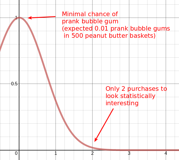
The bell curve above is the null hypothesis. It says all things being equal peanut butter baskets should have a total of 0.01 prank bubble gums. We decide to throw out the null hypothesis when we see that we’re beginning to push into space the null hypothesis considers low probability. In other words the probability that this bell curve is true (known as the p-value) gets below some threshold (often 0.05 or 0.01).
Above you see that according to the normal distribution, having just 2 purchases of prank bubble gum in our peanut butter baskets begins to look like the null hypothesis doesn’t hold. Perhaps there’s a significant relationship here!
However, this is pretty problematic. Our data isn’t distributed by the normal distribution above. Purchases (and other phenomena like natural language) tend to follow a power law distribution. In other words, the short tail/long tail graph from above:

In a normal distribution, the tail doesn’t stretch nearly as far. In the graph of purchases above, the long tail stretches pretty far before dropping to extreme unlikeliness. One or two spurious occurrences of prank bubble gum aren’t seen nearly as significant.
In total we’ve arrived at two important conclusions:
- Jaccard similarity removes any information about how often two events co-occur to be a significance test,
- Normal distribution significance measures get extremely attracted to spurious rare events. A better statistical model needs to be used to measure the significance of long-tail phenomena like product purchases
In the next section, we’ll discuss a better statistical model for the significance of purchases in basket analysis.
Log Likelihood Similarity
Ted Dunning’s paper tackles this problem with a different statistical approach. Ted Dunning notes that the graph of word frequencies in a document, product purchases in a basket, and many other phenomena don’t track the normal distribution. Rather, the binomial distribution is more appropriate.
What’s the binomial distribution? The binomial distribution tracks the frequency at which a coin flip lands heads m times in a row after N flips. It not exceedingly rare that a coin will land heads once. Twice in a row a bit rarer. The probability of 5 heads in a row is really rare, and so on.
Ted realized that the distribution of product sales, words in text, and many other phenomena can better be modeled with coin flips. Or instead of coins with an imaginary 100,000 sided die. Each side of the die corresponds to a product in the store a shopper could choose. The die is heavily weighted though. The chances a shopper rolls “eggs” is significantly more likely than the chance a writer rolls a “prank bubble gum.” Yet there’s still 100,000 sides, so the occasional prank bubble gum is expected. Repeated “prank bubble gum” purchases though become more significant in the same way repeated heads become more significant in coin flips.
Compared to the normal distribution, when you look at a pretty rare event (p=0.001) and how likely it will occur one time in 100 trials, it’s not astronomically rare. The probability is roughly 0.01.
Computing Log Likelihood
The name “log likelihood” comes is a more general statistical significance test. It comes from the idea, similar to the significance tests above, how likely the null hypothesis holds. In our case, the null hypothesis that two items occur in carts independently of one another. Another way to say that is that
P(A) = P(A | B) = P(A | ~B).In English: the probability of A equals probability of A given B, equals the probability of A given not B. If A is peanut butter and B is jelly, what we’re saying is that the probability of peanut butter doesn’t change whether or not there’s jelly baskets. Similarly, we’d expect B to be unaffected by A (jelly to be unaffected by peanut butter):
P(B) = P(B | A) = P(B | ~A).The alternative hypothesis is that there’s something going on between peanut butter and jelly. That the occurence of one tends to create significant deviations from the global popularity.
Now we could get into doing actual log likelihood ratios. Laying out the formula for the binomial distribution and deriving the log likelihood test to accept or discard the null hypothesis. This is derived in great detail in Ted’s paper.
What’s interesting though is the connection between the binomial theorem and information theory. (that connection deserves its own lengthy post). Neveretheless, with this connection Ted’s blog post describes a more straightforward way to compute log likelihood. I want to give you a walkthrough of his calculation with a more intuitive interpretation. This helped me quite a bit to map the underlying map to my own personal sense of what “significant” meant.
First, Ted steps away from probabilities to compute just against the the total count. He divides up all baskets (not just the peanut butter/jelly ones) into four possible groupings, depending on whether or not our target items have been purchased (peanut butter or not peanut butter).
| Baskets with Peanut Butter | Baskets w/o Peanut Butter | |
|---|---|---|
| Baskets with Jelly | 95 | 5 |
| Baskets w/o Jelly | 5 | 99895 |
Here, 95 people bought peanut butter AND jelly. Column 1 holds all the peanut butter purchases. Column 2 holds the non peanut butter purchases. Remember our null hypothesis is that these should be the same. Yet intuitively, we see here that 95 / 100 purchases of jelly in the presence of peanut butter (or probability of 0.95). Compare this to a 5 / 99900 purchases of jelly when no peanut butter (probability of ~0.0005). So clearly it seems the null hypothesis doesn’t hold.
Here comes the information theory connection. Ted notes that another way of showing this is to examine the Shanon’s entropy between each row sum (jelly and no jelly baskets) and each column sum (peanut butter and no peanut butter baskets), and compare that to the entropy of the whole table. He says the significance of the relationship can be tested with approximately:
Entropy( col1_sum, col2_sum) + Entropy (row1_sum, row2_sum) - Entropy( each cell of the table)Or just using peanut butter & jelly:
Entropy( peanut butter, no peanut butter) + Entropy (jelly, no jelly) - Entropy(pb and jelly, pb and no jelly, jelly and no pb, neither pb nor jelly)What’s this Entropy function? Entropy here means the opposite of information. Intuitively, if we can subdivide a value so that 90% goes in bucket A, and 10% goes in bucket B there’s quite a bit of information here. There’s a definite skew towards A. There’s also low entropy. If 50% goes in bucket A and 50% goes in B, then entropy is rather high. Everything is mixed up, and you can’t tell A from B.
This sounds like obvious subtraction, but it’s not. The quantity of available information (the sum of the numbers) also matters. So 10,000 split into 5000 and 5000 is much higher entropy than 10 split into 5 and 5. (The best way to grok the exact math is to look at the Mahout source code
( Now stay with me on this rabbit hole, don’t worry I’ll bring it around to something a bit more intuitive 🙂 )
In the peanut butter & jelly table above, the sum of column 1: 100 vs the sum of column 2: 99900 shows there’s a clear subdivision between each column. The entropy is very low. The information is very high. Similarly you can repeat this for each row’s sum to test the presence of peanut butter with or without jelly. These are factored into the Entropy of col/row sums above.
We take those low values and look at them in the context of the whole table’s entropy. If the table’s cell are all the same, then this entropy will be very high. In the table above, the table’s overall entropy is very low, cells are split into dramatically different values. Conversely, imagine if you have 25 purchases of peanut butter with jelly, 25 without peanut butter, 25 without jelly, 25 without either. This is very high entropy. In this case the high entropy counts against the log likelihood score.
So takeaways are:
- It’s good when the rows and columns sum to something pretty close. (PB is close to non PB; Jelly close to non Jelly)
- It’s bad when the table values are all relatively close.
- It’s good when there’s more total baskets (as potential entropy gets higher)
Based on those rules, for two items to have a significant relationship (positively or negatively), the values should be spread heavily across a diagonal in the table.
For example, a positive relationship distributes a lot of its values across the upper left to lower right diagonal:
- A and B occur together a lot. (upper left)
- Many baskets lack A or B (lower right)
- Not a lot of baskets have just A or just B (lower left, upper right)
A strong negative relationship goes across the other diagonal
- A and B don’t occur together a lot
- Many baskets with just A (bottom left) and just B (upper right)
If we compare two tables with the same overall entropy, you can see both a positive and negative relationship:
Positive relationship:
| B | not B | row sums | |
|---|---|---|---|
| A | 1000 | 5 | 1005 |
| not A | 5 | 1000 | 1005 |
| col sums | 1005 | 1005 | table entropy: high |
Negative relationship:
| B | not B | row sums | |
|---|---|---|---|
| A | 5 | 1000 | 1005 |
| not A | 1000 | 5 | 1005 |
| col sums | 1005 | 1005 | table entropy: high |
In both of these cases we’ve identified something that defeats the Null hypothesis. In the first case the presence of A perhaps predicts B. In the second case the presence of A negatively predicts B.
And here’s some cases where the Null hypothesis (no relationship positive or negative) seems more likely:
| B | not B | row sums | |
|---|---|---|---|
| A | 100 | 400 | 500 |
| not A | 400 | 500 | 900 |
| col sums | 500 | 900 | table entropy: moderate |
Note the row and column sums differ here (there’s less row sum/col sum entropy).
If you’re curious about playing with different scenarios with log likelihood, I’ve created this Google spreadsheet you can use to experiment with different scenarios and compare to Jaccard similarity.
Now you may be wondering, should we rerun this data on our baskets above? Actually log likelihood doesn’t work particularly well in these smaller data sets. You need enough to begin to see the long tail of purchases more concretely. Remember the entropy calculation here increases in proportion to the total possible information available?
Another point is as Ted Dunning pointed out to me: these scores are significance tests. They’re intended to point out what’s statistically interesting. They’re not really great at ranking or scoring (a 500 vs a 700 is probably both equally interesting).
What’s next?
Ok so you’ve had a tour through some of the basic statistics you need to build a recommendation system. I’m increasingly interested in how search engines can be used to implement recommendation systems. This excites me because perhaps you can get all of the above without needing to turn on Spark or Map Reduce to do large distributed calculations. In future blog posts I hope to explore how far we can get with Solr and Elasticsearch in implementing really good recommendation systems. So stay tuned!
I also hope to extend this to discuss personalized search and other relevance features! Look for more blog articles in the future! And don’t hesitate to contact us should you have any search relevance or recommendations needs!