I want to share something powerful I’ve learned from my journey into designing a successful search ranking systems; an area I don’t think most search practitioners are really thinking about:
There’s a tension between diversifying the result set to meet possible user needs vs. improving the relevance of the results against a very specific need we think the user has.
I want to discuss how we might consider optimizing for both: most importantly focusing on measurement of these concerns.
Users come to search with a goal in mind. They hunt for what they want, expressing their needs in natural language keywords. Much like any conversation, the initial ‘statement’ is an imperfect expression of their needs. Users might start early with ambiguous keywords (like ‘waffle maker’). When search seems to need clarification, they step back, think how to clarify what they’re saying, and reformulate their language to something more specific (‘waffle maker’ => ‘blue waffle maker’). Eventually as less and less ambiguity is left in the user’s query they have a very clear specification of what they need (‘blue double waffle maker for commercial kitchen’).
We realize it’s a fallacy, especially in these queries early in the conversation, to consider all users that share the same keywords as having the same goals/needs. “Waffle maker” is so broad, encompasses so many needs, that it could mean anything from an Olaf Waffle Maker from the movie Frozen to something more like a George Foreman Grill. All are 100% relevant to the keywords (though perhaps not to the user’s need).
On the other end of the spectrum, when a user gets more specific (‘blue double waffle maker for commercial kitchen’), the focus switches to relevance to that intent. We see more of the user’s goal – can we give results close to that target? And we do literally mean proximity. The vector space model of information retrieval presumes can can put the user’s query in a vector space (like x/y coordinates) and we can get ‘close’ or ‘far’ from that target.
For example, with a search for ‘blue double waffle maker for commercial kitchen’ we might show first an exact match (‘blue double commercial waffle maker’). We might follow with a red commercial waffle maker. Or a blue non-commercial ones. Which attributes are more important / make most sense to drop becomes a part of relevance tuning. By prioritizing certain attributes over others, if we are missing some (say the color) then perhaps this user might still be satisfied with something imperfect for their need, but good enough (like a ‘red commercial double waffle maker’).
The search results diversity measurement gap
We don’t have canonical measures of search result diversity. And that’s a huge problem. Especially because queries on the ‘diversity’ end of the spectrum are where users often start. Instead of results that reflect a range of possible intents/next steps, search teams frequently flood the SERP with repeated, similar looking search results. Instead of a range of waffle makers, we disappoint our users with nothing but Olaf waffle makers.

O laf the puns up you search nerds
We have pretty good methods for measuring relevance. We can use judgment lists along with classic search metrics like NDCG and tools like Quepid / RRE / Quarite to measure how well a query does at returning a relevant result sets. If you’re unfamiliar – judgment lists come from a number of places, like clickstreams, conversions, crowdsourcing, or expert raters. The crowdflower ecommerce search relevance dataset is one example. It has crowdsourced judgments for several e-commerce site’s queries. Each document is graded from 1 (very irrelevant) – 4 (extremely relevant) for that query.
For example, check out this search for a very specific type of Brett Favre (US Football Star) jersey:
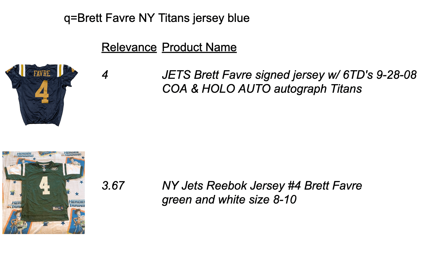
(If you’re curious about this weird query: it turns out that the New York Jets used to be called the Titans – confusingly now the name of a different NFL team. On Sept 28, 2008, while Brett Favre played with the Jets, the Jets played in old blue NY Titans jerseys. )
I can validate that, indeed, the judgments make sense. A successful search system would perform a ranking of results where the item closest to the user’s specification comes first, followed by gradually ‘farther away’ items. Most classic relevance metrics, like NDCG or Precision can measure what we need: whether the search engine is doing its job placing items close to the users intent (blue Favre jersey) above lesser candidates (the green ones).
On the other hand, the relevance measurement regime fails for queries that need the ‘diverse’ treatment. Here’s a handful of judgments for our friend ‘waffle maker’:
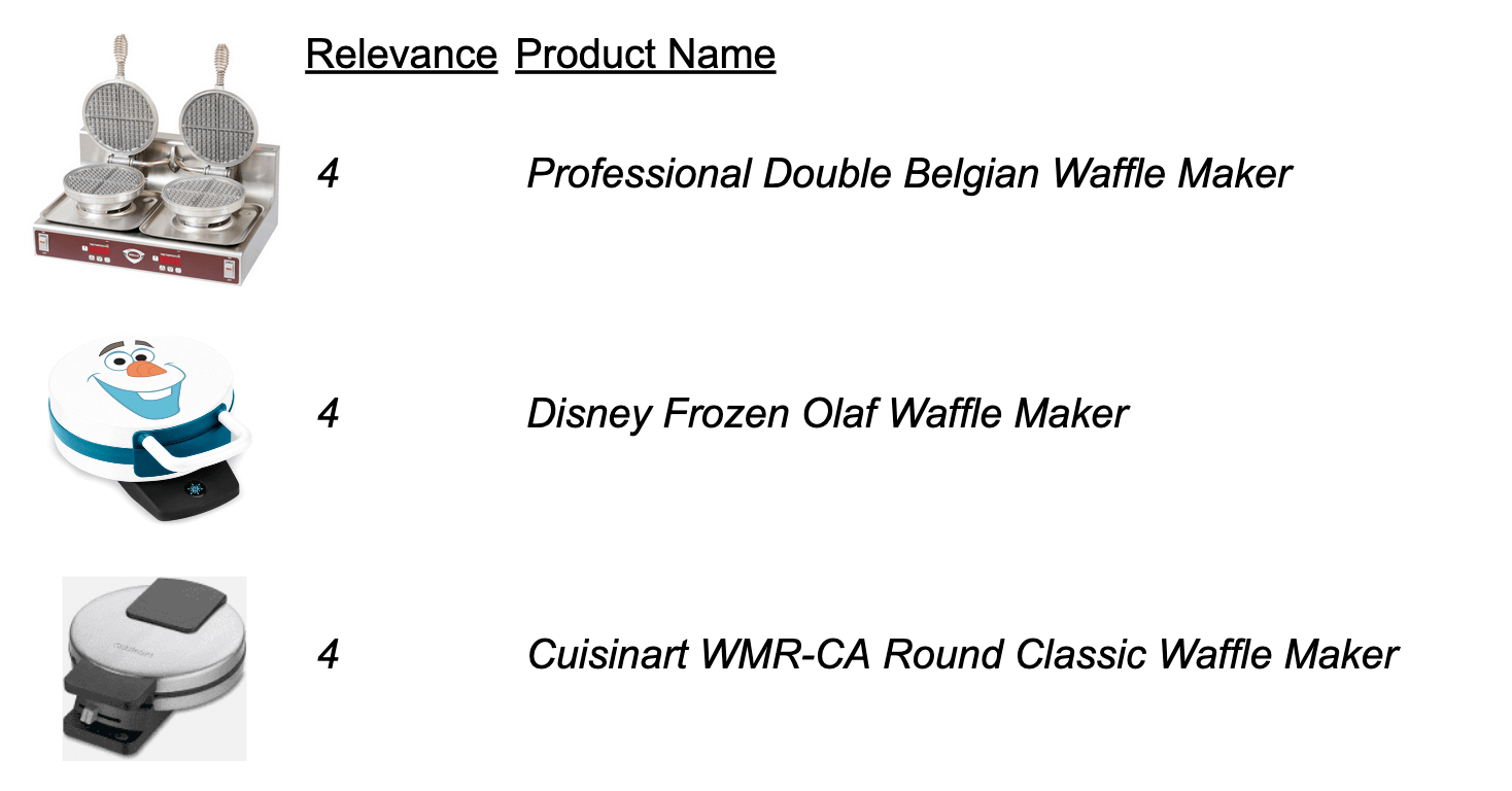
You can see the diversity measurement problem here. Notice we have a set of waffle makers, all very different, but each perfectly relevant for the ‘waffle maker’ query. From a relevance mindset, a page full of ‘4s’ would be the ideal outcome. Using a precision, we can compute the precision of the page that contains 3 very different ‘waffle makers’: (4+4+4) / 12 = 1 – perfect! We can also compute the precision of a page with 3 Olaf waffle makers: (4+4+4) / 12 = 1 – also perfect!
No matter the ‘relevance’ metric we chose, it won’t measure result diversity.
Achieving relevance in these ‘diverse’ queries is a necessary but not a sufficient condition. It’s good that the search engine returned waffle makers. Certainly a teddy bear or television in the search results would be bad. However, relevance here is not enough to build a good search experience.
Diversity measurement is hard, let’s go shopping
As you can see, when trying to measure what ‘success’ looks like, the diversity end of the spectrum doesn’t play by the same rules as relevance.
With the Brett Favre query above, a user expressed a very specific goal, and we might expect them to convert if we were successful at satisfying their goal. The item that performs / converts well might arguably most relevant.
But these early queries like ‘waffle maker’ shouldn’t be held to that standard. That’s not these query’s role. They start, they don’t complete the user’s mission. A successful search system doesn’t, and probably shouldn’t, simply optimize for ‘conversions’ this early in the conversation.
With diversity, the user needs to see the diverse range of options possible, to select a new direction, reformulate their query. Users need to feel confident they still have the scent of information for their conscious or unconsious needs. A page full of Olaf waffle makers is unlikely to achieve that goal.
I’m reminded of my colleague René Kriegler’s slide from his original MICES keynote discussing e-commerce search:
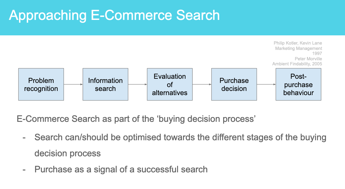
Set aside waffle makers for the moment, and let’s think instead about a very expensive purchase. One where you’re not likely to get lucky and see exactly what you want on the first query. Something like TVs.
If you buy a television, you’ll do a lot more research. You’ll undergo a long buying decision-making process. You’ll try to formulate the problem and gather information. Purchase would only come after many, many searches.
The diversity vs relevance spectrum doesn’t correspond neatly to René’s “Buying Decision Process”. For example you can imagine you might have a ‘relevance’ query for a specific kind of television and simply be gathering information. But it does serve to illustrate that users go through a process where, especially earlier, we might expect more of the diverse sorts of queries. Maybe Amazon isn’t crazy for both making it easy to purchase AND a great place to do research into products.
Some Diversity Measurement Approaches
I won’t pretend to have all the answers. But with diversity, you want to answer the question: “Do the results I provide help further the user’s search towards a satisfactory result?” or maybe “do the results (or UI) give user’s visibility over the possible clarifications of their search.” Is there enough ‘scent’ for most users? Spitballing, here are two ideas that I hope trigger discussion and reaction in the community.
Gini Coefficient (or Inig Coefficient?)
Gini coefficient: how equally distributed over a well known set of categories (most important facets) is the data. This has been the most common statistic I’ve seen used to measure diversity. It’s appealing because (a) some search teams can pinpoint which kind of ‘facet’ might be most important for a query (like size for shoes; color for waffle makers) and therefore (b) can know which categories make most sense to diversify over.
The intuition behind the Gini Coefficient is hard to explain without a graph. Let’s walk through an example.
In the graph below, we have 3 colors of waffle maker (Red, White, Blue). The graph below is cumulative. So it’s not a graph over the number of results per colors instead each column adds to the column to the left. The first value, just “R” counts all the Red waffle makers. The second “R,W” are the Red+White waffle makers. Finally the last column “R+W+B” represent all of our waffle makers.
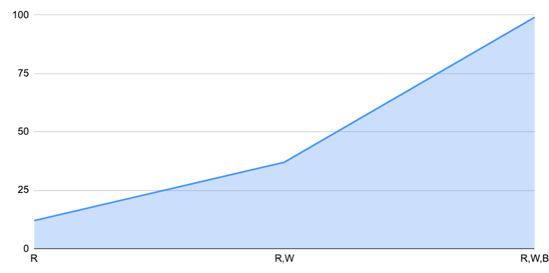
The other trick is that the first value R is the smallest subset, W is the second smallest, and so on. So it’s both sorted and cumulative. This guarantees the graph looks like this kind of ‘elbow’ curve. If you want to sound fancy at parties, this is a Lorenz Curve.
The ideal Lorenz Curve is a straight line. In this curve, ever column adds equally to the total, and there’s perfect equality over each of the classifications. In other words, it’s not very curvy at all, it’s just a line:
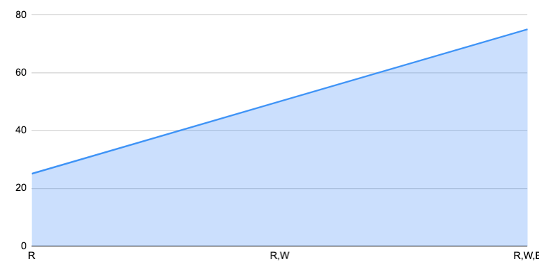
The classic Gini Coefficient goes from 1 (most unequal) to 0 (most equal). But I think it’s more useful to go from 0 (least diverse result set) to 1 (very diverse result set), so we don’t get confused on which metrics ‘higher is better’. So really what I’m about to tell you is really 1 – Gini Coefficient which I will cleverly name the Inig Coefficient.
Quite simply we will compute the area of our result set’s distribution (the top curve) divided by the area of the ideal (the line). You can see that more clearly in the graph below. The blue area would be divided by the red ‘ideal’ area. Close to 1, they overlap and we say we have a maximally diverse result set, where each category has equal representation. Close to 0, we are dominated by one of the categories.
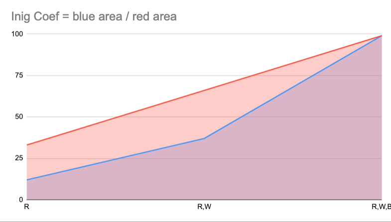
I computed this in the spreadsheet using the area of each trapezoid segment for the blue curve. Summing that up, I arrive at the blue curve’s ‘area’. Then I compute the area of the red triangle. Dividing the first value by the second gives us our Inig coefficient.
Here’s a pretty unequal case, Inig coefficient of 0.3333…
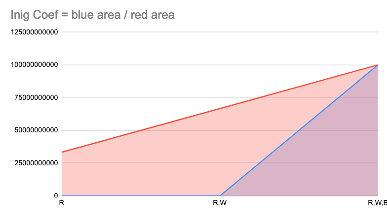
A more equal distribution, Inig coefficient of 0.86
We can of course restrict Inig to top N results to get Inig@10, or over whatever top N makes the most sense.
I like this metric as it’s fairly intuitive. However it does require understanding the correct categories for a given query to diversify for! Not all search teams quite know for every query what the right categories to cover to ensure a diverse query set from the user’s point of view.
Min Refinement Precision At Root Query (aka ‘Working Backwards’)
If we know the top refinements for our diverse query we can grade the results of the original query using relevance judgments from the common refinements. We might take minimum (or perhaps mode) of all of the refinement queries’ precision when graded against the original query’s results.
For example, let’s say we want to evaluate “waffle maker”, using it’s top 2 refinements “red waffle maker” and “extreme waffle maker”. “Doug’s Red Waffle Maker” and “René’s Red Waffle Maker” are both a grade of “4” for query “red waffle maker”. And “Waffleator 9000” and “Wafflecannon” are both grade of “4” for query “extreme waffle maker”.
A ‘waffle maker’ result set that only returned red or extreme waffle makers would be problematic for our ‘diversity’ criterion. One that returned a mixture of results from top refinements (both ‘red’ and ‘extreme’) would be better (at least that’s what this metric presumes!).
So this is a nice and diverse ‘waffle maker’ set:
- René’s Red Waffle Maker
- Waffleator 9000
- Doug’s Red Waffle Maker
- Wafflecannon
Precision@4 against ‘red waffle maker’ = (4 + 0 + 4 + 0) / 16 = 0.5Precision@4 against extreme waffle maker’ = (0 + 4 + 0 + 4) / 16 = 0.5
Min Refinement Precision = 0.5
However this situation would be problematic:
- René’s Red Waffle Maker
- Liz’s Red Waffle
- Doug’s Red Waffle Maker
- Red shiny chrome waffle maker
Precision@4 against ‘red waffle maker’ = 1Precision@4 against ‘extreme waffle maker’ = 0
Min Refinement Precision = 0 <- problem!
Our metric might show here that users looking for that ‘extreme waffle experience’ might not see anything reflected in the initial ‘waffle maker’ query. They might give up, writing off the search experience as not having the information scent for their kind of waffle maker. Without the ‘extreme’ waffle makers in the mix, they might not have teh lightbulb go off that they themselves need to clarify their intent with the term ‘extreme’, so they might give up.
I like this metric as it doesn’t require us to understand the categories to diversify over. Unfortunately, this metric is somewhat biased by the relationship between diverse result set and refinements. Users may never refine their queries if they aren’t offered a diverse result set. Or they may refine them in a particular way given the result set.
It’s also probably important to think about how to define the top refinements. Should you cluster top refinements, but eliminate candidates that overlap too much? And it may be important instead of picking top N refinements, to instead pick the top refinements as scored by statistical significance.
A bit on ranking function design: Ranking Intents, Not Just Documents
To measure relevance and diversity effectively, we may need to reflect a bit more about a solution framework to this diversity/relevance dilemma.
I propose we might want to reformulate our thinking of a search ranking into roughly two stages, with each stage having a different emphasis depending on where the query lives in the relevance-diversity spectrum:
- What are the user’s likely intents? (user preferences conscious or unconscious, categories of documents, clusters of documents, etc)
- Given those intents, what are the most relevant documents that role up to each intent?
In the first step, we have a probability distribution or a ranking of intents. We might evaluate this ranking independently of step (2). Perhaps it relates to distribution over categories or reflection of refinements. But likely it goes deeper into personas, user segments, non-facetable categories (like proximity), and perhaps latent features of document text. You might have more context on the user or query to know which intent is more likely (though probably you don’t want to go too far with this assumption).
In the second step, we hold an intent constant and rank against it. We presume we know what the user wants and aim to rank candidate documents close to that target (just as in our Brett Favre example above). This is what search engines are built for
I think likely there’s an important relationship to taxonomies here that might help us with this problem.
At the ‘top’ of the taxonomy, you have broad categories – like ‘waffle makers’. When a search corresponds to a broad topic, you want to gather a healthy, diverse set of candidates from the next layer down (extreme waffle makers / chef waffle makers / etc). You can even use the taxonomy to explicitly say “we have a lot of waffle makers – what kind do you want?”. But if you’re farther down in the taxonomy, searching for obscure forms of Brett Favre memorabilia, you are trying to get as close as possible while still being true to the user’s intent. You ask yourself whether it is OK to violate the users ‘color’ preference? Or show jerseys of other famous players? We know in these situations the results won’t be 100% relevant. But maybe they would be grateful for the 90% option. Where to cut that off is a tricky problem to solve and is rather domain & user specific.
To restate the original problem, how would we measure whether we had a correct probability distribution over intents for a broad query? Perhaps a taxonomy (generated or otherwise) WOULD help.
Perhaps the key question becomes:
Does the taxonomy cleanly separate one set of intents from another?
In other words, do extreme vs chef waffle makers overlap a lot. If so, it’s not a useful ‘next step’ for our users. If they tend to segment users of early queries successfully, then we might say it’s a good taxonomy – and therefore can be used to present a diverse result set.
As an example, a ‘clean’ breakdown of ‘trousers’ might be something like
- Informal Trousers
- Jeans
- Corduroys
- Formal Trousers
- Khakis
- Cuffed Dress Pants
A bad taxonomy would be:
- Trousers with Two Legs
- Clown Trousers
- Jeans
- All Other Trousers
- Trousers with One Leg
The first taxonomy cleanly divides the ‘trousers’ space. We can cover more of that space more confidently and efficiently. We might monitor that users navigate/refine into each category in closer to equal terms (see Inig metric above). Whereas the bad taxonomy, everyone would go into “Trousers with Two Legs” and probably next “All Other Trousers” – not a good Inig over user next steps.
Likely Intent Ranking Systems – First Class IR systems with Search and Recommendations
To conclude, there’s a ton more to discuss on this topic, and I hesitate to begin writing another book via this post 🙂 In particular, I haven’t discussed HOW to perform diversity. Daniel Tunkenlang has a blog post on results clustering. Certainly the search engine’s grouping feature is an option. Explicit UI’s built for diversity are another option.
I’m also interested in connections to other kinds of Information Retrieval. I wonder whether ‘results diversity’ exists as a kind of third system in between recommendation systems (no user intent expressed) and relevance (hard user intent expressed). It’s like this is a 3rd modality – soft intent – rarely addressed by the IR community. It seems likely a modality needing it’s own systems. If search engines care about the ‘hard intent’ end of this spectrum, collaborative filtering systems focus on the ‘no intent’ side. What’s the ideal system for the ‘soft intent’ problem?
Such a third ‘soft intent’ IR system seems appropriate for ranking intents, not documents. Further, it seems very much tied to the broad topic of intent detection, which for most search teams is an increasingly complex piece of functionality sitting between the query and the search engine. Perhaps we need to think of this component as a first class IR system, not some add on to search.
Anyway, as this is my initial blogging foray into this topic, I certainly hope to ‘diversify my response set’ by hearing from you and your opinions on the topic. Get in touch if you’d like to provide feedback – I’m eager to discuss! Come find me at Relevance Cornucopia , Haystack EU, or Activate if you’d like to discuss in person.